The App Footer is a universal component designed to provide essential links and content at the bottom of the application.
Usage
When to use
- On every screen of an application where universal links or content are required.
Order of content
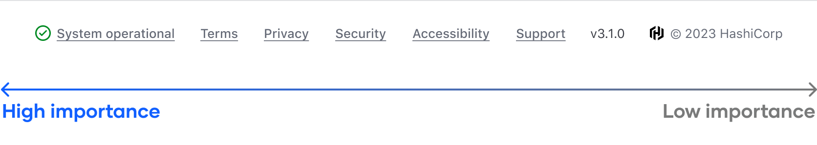
While the Ember component allows flexibility in the ordering of links and content, we recommend the following structure for a consistent visual appearance across applications:
- StatusLink
- LegalLinks
- Additional links
- Plain text items (or metadata, such as version numbers)
- Copyright
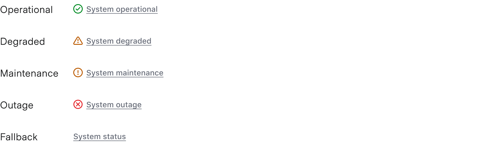
Status link
The StatusLink is used to communicate the application status via a third-party service or tool (such as statuspage.io). If needed, the status can be customized to suit the specific product needs.
Legal links
A set of standard legal links are provided by default. These are recommended for customer-facing products, but can be turned on/off within the component as needed.

Additional links
Additional links can be added as necessary. Common examples may include linking to a changelog, GitHub, etc.

Plain text items
Plain text content can be added after the links. This is often used for displaying the version number or other metadata related to the product.

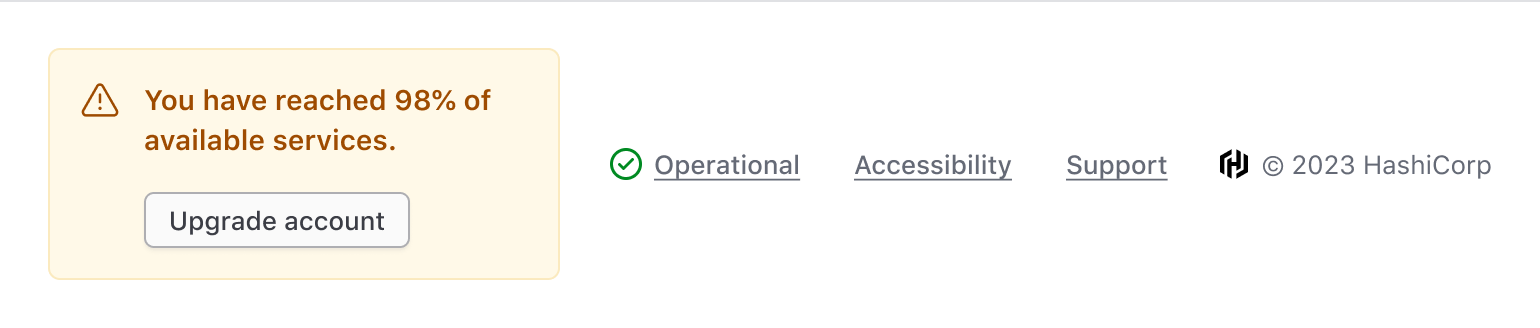
Extra content blocks
Extra content blocks are available before the list of links and before the copyright.

The extra content block can be used to add quick interactions that change the whole application, e.g., a theme switcher.

Avoid adding information that's critical to the user's journey in the App Footer.
Themes
The App Footer supports both Light and Dark theme options. The dark theme can be used when there is a need for a footer on a dark background, e.g., a loading screen, but it should be used sparingly.

Responsiveness
In Figma, we support two size variants, Large and Small, to help illustrate how the component will respond to different viewport sizes. In code, the component is responsive.
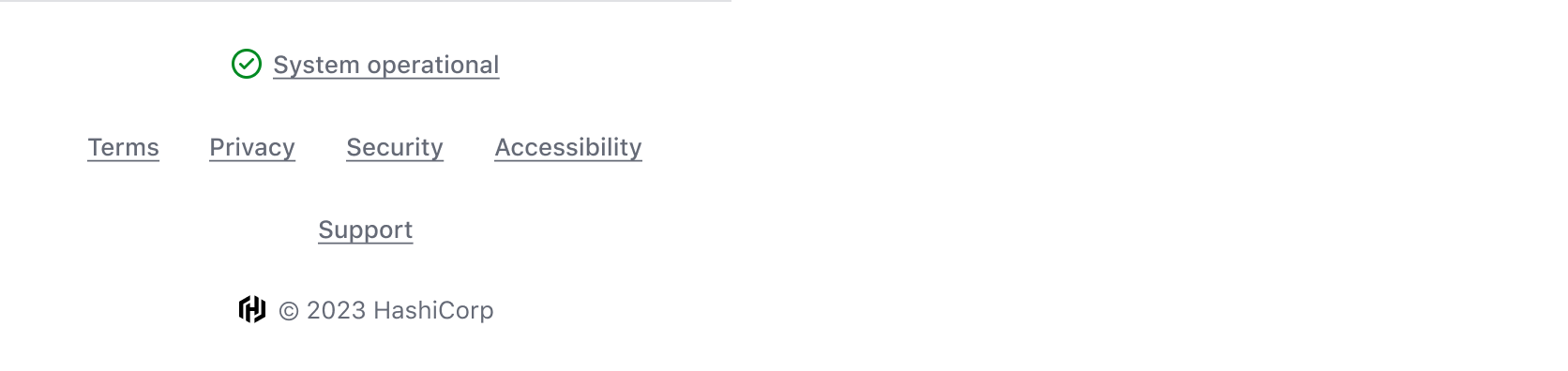
Large
The Large size accounts for most larger viewport sizes and, depending on the number of links and additional content, will display elements in a single row or wrap as the viewport size is reduced.
Please note, this screenshot is reduced in size to fit within the content container of the website.

Small
How to use this component
The AppFooter is used to display a brief list of useful links and information relevant to an entire application.
Basic invocation with recommended content
The AppFooter contains only a copyright by default. The provided LegalLinks child component is recommended for inclusion in application footers for our cloud products such as HCP and TFC.